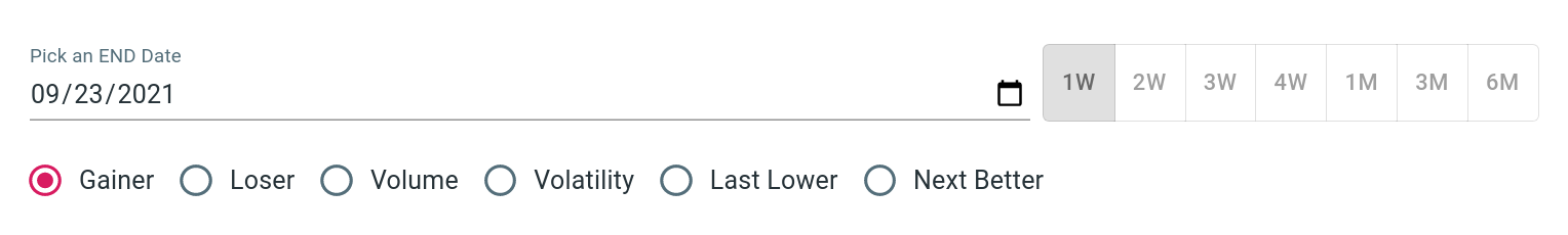
Trending function is a unique feature we don't find in other tools. The idea is: if I could rank the stock's performance, how to see this performance changes over time? If ranking was a snapshot in time based on the latest data available, trending now introduced a time line which makes the comparison much interesting.
Trending Values
We provide trending on these indexes:
| Value | Description |
|---|---|
| Gainer | positive daytime return % |
| Loser | negative daytime return % |
| Volume | reported volume/share outstanding |
| Volatility | (high-low)/low |
| Last Lower | see stock trend |
| Next Better | see stock trend |
User can set a date range by changing the end date (default to
TODAY), and how far back he wants to go (default to 1 week).
Top Ranks
Top ranks show ranks of each day based on selected value index and the time period. There are two types of view we provide: a static/matrix view, and a race chart.
Matrix view
The matrix view shows the ranks in a grid. Each column represents a date. Dates are arranged in order with the most recent shown first (from left to right). Each symbol is color coded, assisting user to quickly identify a pattern, for example, a certain symbol/color is on the rise or falling.
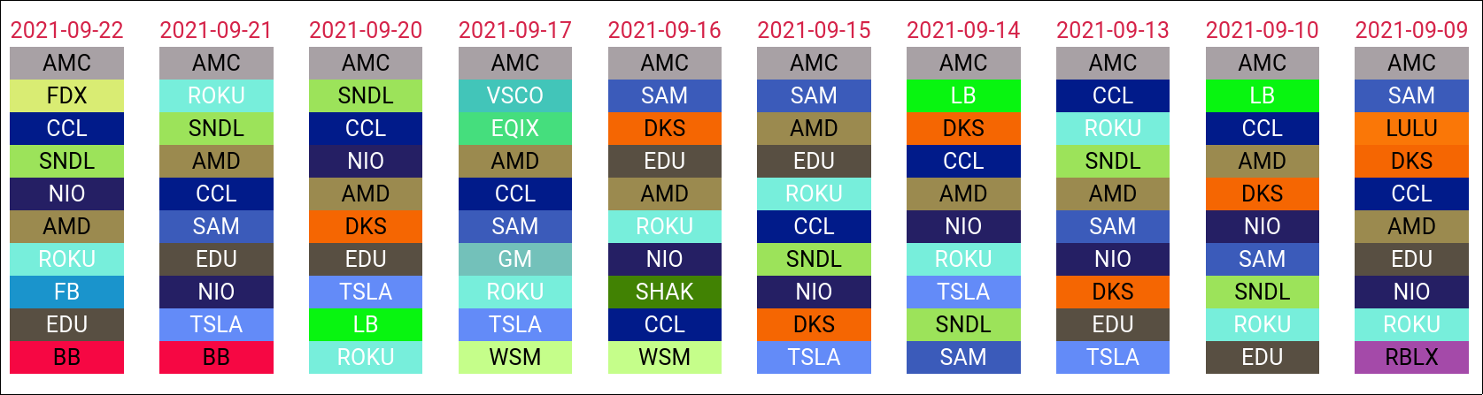
In this example, we can quickly observe a few things about volumes: AMC is dominating, meaning lots of transactions are happening, CCL, AMD, ROKU, TSL, EDU, DKS were also busy, BB got some attention in the last couple days but not before, .... you get the idea.
NOTE that these rainbow colors are auto-generated to provide the largest contrast. However, due to limitation of the algorithm, some colors may become hard to distinguish visually. Changing any control value would force a re-assignment of colors. Thus, user can repeat this till he finds a color combination he likes.
Race chart
Using the toggle control user can switch between the matrix view and a race chart. The race chart is a great way to watch how a stock's rank changes over time in comparison to its peers. The race can be paused and rerun.
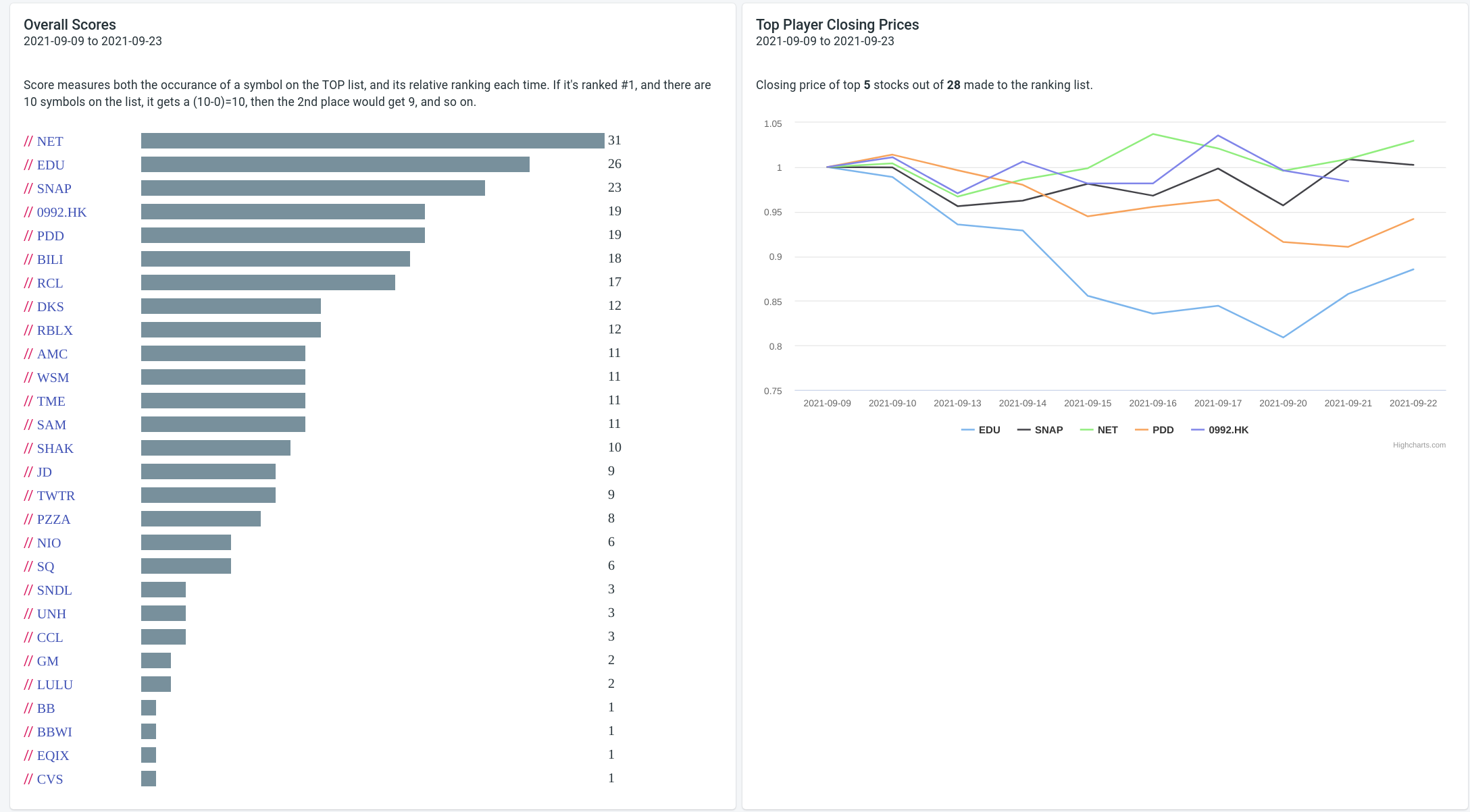
Overall Score
A day-to-day is great, but how to evaluate a stock's if it had a top position one day, but a 3rd place another, then maybe not even show up on some days? To address this we have developed a score to include both its position on a given day and its frequency of on the list.
We assign a 1-10 points to each position, with top position worth 10 points, 2nd place 9 point, and so on. Then we keep score for each stock in this analysis and compute a total points, thus the score.
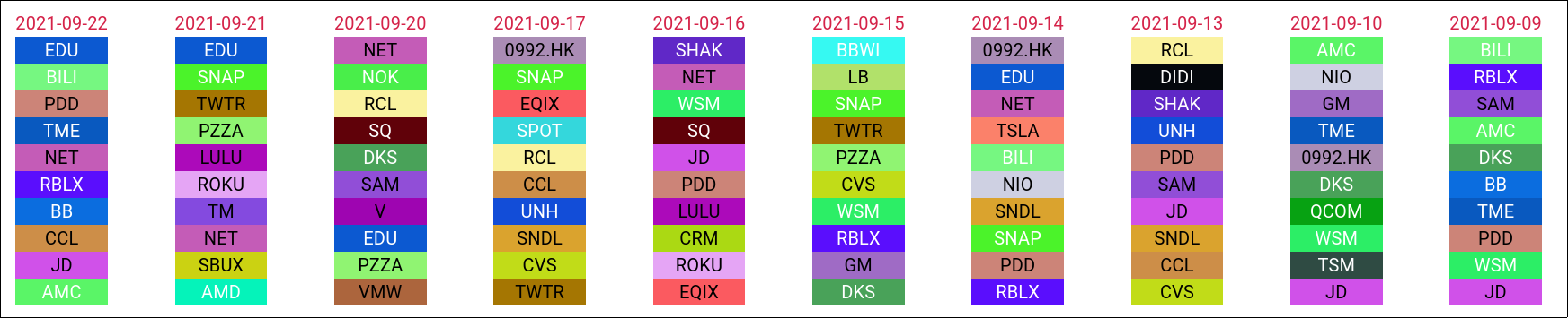
Now rank them by this score and view price chart of the top 5 of them. Here in the example we are showing a two week score of gainers. NET (green) ranked top and indeed its price went up slightly. However, EDU (blue) by comparison underperformed even though it had a 2nd place in score. This became sensible when we also look at the ranking matrix (below). EDU had high score because it scored high position 3 our 4 times it made the list. So during the days it missed the list it must have had quite a down time, thus explained why its actual price was underperformed despite of its high score.
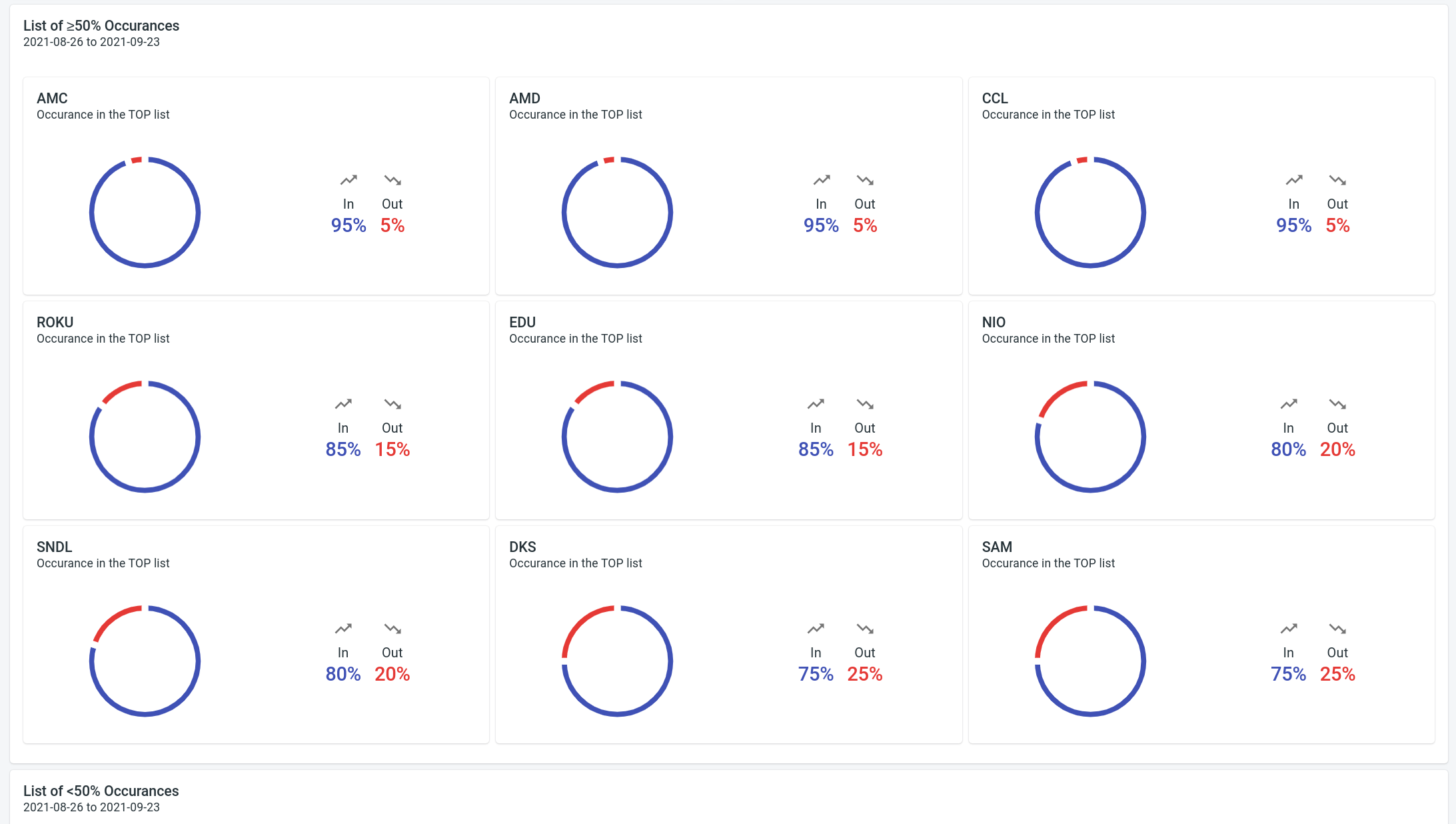
Occurrences
Occurences counts the time a stock made to a list. The meaning of the list depends on the value index you have selected. For example, being often on the gainer list speaks well of a stock, while being often on the loser list doesn't.
Occurrences are grouped into two: greater than or equal to 50%, and less than 50%. For each stock, a chart is drawn to exactly how many days (as percentage of the total days selected) it made to the list. In this example below, showing the occurrences of volume ranks, we could suspect that AMC w/ its 95% of the time in the list saw more market attention than DKS w/ a 75% in. Make sense?
-
daytime return % = (close-open)/open↩
— by Feng Xia